ADVERTISEMENT
 Just in case your were starting to wonder if I would make anything other than a geometric sans, here are some images of the fonts I am currently working on. Feel free to comment/make suggestions.
An as-yet-unnamed serif. I have been working on this one for quite some time, expected completion date? Another long time!

A slab serif inspired by my LT Chickenhawk font. Expected completion? Soon, July sometime.
Update: This became a the Happy Phantom Font Family, another spin-off of this design is the Cupid de Locke Font

"Ramses the Eternal" a handwritten script font I am working on should be done sometime in July, and it's counterpart...
Update: Believe it or not, this font design was the start/inspiration of the Sachiko Font.
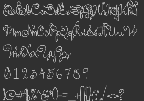
"Ramses the Damned" another handwritten script font. To be done in July possibly. Counterpart to "Ramses the Eternal."
Those are just a few of the fonts I am working on right now. Let me know what you think! Comments, questions, suggestions? I want to know what you think!
The Chickenhawk Chronicles: Preface

Upcoming Font Releases

Newsings

New Dingbat & Other Projects

7 comments:
I like the as-yet-unnamed-serif, that one could very well go commercial. Yet, as you know me ... always a comment ... to me the 'f' doesn't seem to relate with the rest. Food for thought?
Well, fancy meeting you here :P J/k
Thank you for your kindness on my 'as of yet unnamed serif', thought this image almost embarrasses me now! The 'f' is one of many characteristics that needs addressing !
When I resume working on this, I fully agree, 'f' will have to go.
But I do think this when I complete it, which will at least take a few more months, it will be my best font altogether. I will be sure to let you & all the folks at AbstractFonts know when that is :)
Have a super day, thanks for coming by :)
Hey, you also might find the comments on this humorous http://www.fontspace.com/nymphont/lt-nutshell-library
he he.
How dare people make statements like that ...
LOL no I totally understand really, until you look very closely at the fonts they look like the same font! And believe you me if/when I think someone copies another typeface I will say something too (sometimes at least)!
You know how much I love Avant Garde I am sure, this font really bothered me when I first saw it. It still does http://www.dafont.com/font-comment.php?file=reboard
Makes me want to wretch! What's really strange to me, is that no one else seemed to be bothered by it, but the maker of Birth of a hero caught some flak for doing virtually the same thing. http://www.dafont.com/birth-of-a-hero.font
At first at Abstract, I think 3 of you (moderators) were pretty certain I had copied my font. Being that I did not, we all know the sillyness that transpired when I discovered this. My apologies again, you only get one chance to make a first impression. I am glad that somehow you guys managed to accept me :P
And in hindsight, I completely understand why you thought I had copied the font. The majority of popular font 'designers' these days, have no clue! They think that IS font design, to start with and EXISTING FONT. Morons.
I am a newbie and have much to learn, but of the newbies, I am not the same breed. I come from the same logic love and respect for typography as you guys @ Abstract, you know?
I think it's way cool that you guys @ abstract really know your stuff. That's awesome actually.
LT Nutshell Library, looks almost identical to another font. I just wish I knew that before I made it! Oh well though, no biggie!
Forgive me for the lengthy comment, I just love to talk shop I guess :) I havent been by the forum recently because on my last visit it was really quiet.
Cheerio,
~Lauren
Sorry Lauren, sorry, sorry, sorry! Forgot the smile! Shame on me!
:)
OK?
LMAO
He he yes, ok.
Post a Comment
Comments are moderated